
Using TailwindCSS with Ant-design
TailwindCSS, a popular utility-first CSS framework, integrates seamlessly with Ant-Design's UI library through a custom plugin. By implementing this plugin, developers experience enhanced development efficiency and a cohesive design system that combines the strengths of both tools.
Lately I've been using Ant-design (will be mentioned as antd) as my UI library, but there are some problem when I tried to using it with TailwindCSS (will be mentioned as tailwind).
On this articles, I'll sharing how I'm using Ant-design theme with TailwindCSS.
On this articles, I'll sharing how I'm using Ant-design theme with TailwindCSS.
#The Problems
While antd fulfill most of my component needs sometime I still need to create my own component using tailwind, but it kind of annoying when I need to use colors / value from my antd theme.
From the Ant-design documentation, there actually 3 way to use antd design token :
From the Ant-design documentation, there actually 3 way to use antd design token :
- Using
useTokenhooks - Using
getDesignToken - Using CSS Variables (version 5.12.0 ++)
The problem I have with using
(IDK if it's only me, but I really love tailwind intellisense since it's save me a lot of time)
useToken or getDesignToken is I need to use style props to use it, and yes I could use CSS Variable directly in className but I can't have any autocomplete or see the value.(IDK if it's only me, but I really love tailwind intellisense since it's save me a lot of time)
So I decided to spend couple of hours to add antd design token inside of tailwind for my own comfort and experience while developing a web.
#The Solution
This section will be separated to couple parts :
- Antd theme config
- Creating tailwind plugin
- Using it
##Antd Theme Config
Most of this section are from antd documentation.
Here are the code that I use on my portfolio site :
Here are the code that I use on my portfolio site :
import { ThemeConfig, theme as t, App } from "antd";
import { AntdRegistry } from "@ant-design/nextjs-registry"; // For react you can use cssinjs

export const antdTheme: ThemeConfig = {
	// We will only using this token value for tailwind
	token: {
		colorPrimary: "#f46e1f",
		colorInfo: "#f46e1f",
		colorSuccess: "#23ec7d",
		colorWarning: "#facc14",
		colorError: "#fa1852",
		colorLink: "#51b2ff",
	},
	algorithm: [t.darkAlgorithm]
}

export default function ThemeProvider({ children }: PropsWithChildren) {
	const themeConfig = useMemo<ThemeConfig>(() => {
		return antdTheme
	}, [])

	return (
		<AntdRegistry>
			<ConfigProvider theme={themeConfig}>
				<App>
					{children}
				</App>
			</ConfigProvider>
		</AntdRegistry>
	)
}
And my layout file :
export default async function RootLayout({children}: Readonly<{children: React.ReactNode}>) {
	return (
		<html lang="en" clasName="antd">
			<body className="bg-antd-base text-antd-base-text">
				<ThemeProvider>
					{children}
				</ThemeProvider>
			</body>
		</html>
	)
}
This is the basic setup of using antd on Next.js, next I will explaining how I make the plugin.
##Creating Tailwind Plugin
To simplify it, the plugin I wrote will load the antd theme we wrote on
So first, I need to know what options should I include for the plugin, and I decided the plugin need at least options for :
ThemeProvider, and generate thing from the token.So first, I need to know what options should I include for the plugin, and I decided the plugin need at least options for :
- Theme, in case some project need multiple theme config
- Extend (opt), should the plugin overwrite the default color?
- Prefix (opt), should the plugin start with some prefix? this will be useful when we use multiple theme
Now to writing…
import plugin from 'tailwindcss/plugin';
import { theme as t } from 'antd';

type AntdTwPluginOptions = {
	theme: ThemeConfig;
	options?: {
		extend?: boolean;
		prefix?: boolean;
	}
}

const antdTwPlugin = plugin.withOptions<AntdTwPluginOptions>(
	(opt) => {
		// Here we add thing like base, utility, and other thing
	},
	(opt) => {
		// Here we add theme to be added to the config
	}
)

export default antdTwPlugin;
###Adding Base Style
For base style or the first function, I only add base style for headings and paragraph.
So even if I don't use the
You can also add other thing fitting your needs, like creating utility for motion or anything else.
So even if I don't use the
Typography component, it still have at least the font size and line height.You can also add other thing fitting your needs, like creating utility for motion or anything else.
Since the font / line height from the token are number, I can simply add
Also you can find all these design token from the documentation.
px on the end to convert it to string value.Also you can find all these design token from the documentation.
(opt) => {
	const token = t.getDesignToken(opt.theme);

	return ({addBase}) => {
		addBase({
			h1: {
				fontSize: `${token.fontSizeHeading1}px`, // Since fontSize are returning a number, I need convert it to px
				lineHeight: `${token.lineHeightHeading1}px`
			},
			// h2 - h5, and also paragraph config goes here
		})
	}
}
###Adding Theme to the Config
The second function will be thing that will be added to the tailwind config.
Most of the thing here will be show up in the intellisense.
Most of the thing here will be show up in the intellisense.
####Generating Colors
Most of the colors from antd theme are in
While I can use it as it is, it need to be converted to
hex format.While I can use it as it is, it need to be converted to
rgba so I can use opacity (something like bg-antd-primary/50)function convertToRgba(color: string){
type ColorType = "hex" | "rgb" | "rgba" | undefined;
let colorType: ColorType;
if(color.startsWith("#")) colorType = "hex";
if(color.startsWith("rgb")) colorType = "rgb";
if(color.startsWith("rgba")) colorType = "rgba";
switch(colorType) {
case "hex":
const hex = color.slice(1);
const bigint = parseInt(hex, 16);
const r = (bigint >> 16) & 255;
const g = (bigint >> 8) & 255;
const b = bigint & 255;
return `rgb(${r} ${g} ${b} / <alpha-value>)`
case "rgb":
const rgb = color.slice(4, -1).split(",").map((c) => c.trim());
return `rgb(${rgb[0]} ${rgb[1]} ${rgb[2]} / <alpha-value>)`
case "rgba":
return color;
default:
return color;
}
}
This utility function will convert all the colors so it support tailwind opacity, now we need to create an object of the colors.
There are 3 type of colors on antd :
There are 3 type of colors on antd :
- Base colors, basic colors from antd like
blue,volcano,gold, etc. - Theme colors, colors from our theme config like
primary,success,error, etc. - Extra colors, it's the colors that probably won't be used such as
fill,elevation,border, etc.
And every colors type has different structure
type BaseColor = "blue" | "purple" | "cyan" // etc...
type BaseColorVariant = "DEFAULT" | "1" | "2" | "3" | "4" // and so on till 10

type ThemeColor = "primary" | "success" | "error" | "warning" | "info";
type ThemeColorVariant = "DEFAULT" | "hover" | "active" | "text" | "text-hover" | "text-active" | "bg" | "bg-hover" | "border" | "border-hover";

// For extra colors, it has different structure
// Example elevation such as layout / container / elevated / spotlight only have DEFAULT
// but fill will have DEFAULT / secondary / tertiary / quarternary
// You can make the structure however you like
Now we can generate the code, in my case I'm making 3 function for each colors type. It is basically the same, but will return different structure.
So I'll only show 1 example.
So I'll only show 1 example.
function generateBaseColor(
	token: AliasToken,
	classTransform: (name: BaseColor) => BaseColor
): Record<BaseColor, Record<BaseColorVariant, string>> {

	// To prevent repeating long code, I make a function
	function generate(color: BaseColor): Record<BaseColorVariant, string>> {
		return {
			DEFAULT: convertToRgba(token[color]),
			1: convertToRgba(token[`${color}-1`]),
			2: convertToRgba(token[`${color}-2`]),
			3: convertToRgba(token[`${color}-3`]),
			4: convertToRgba(token[`${color}-4`]),
			5: convertToRgba(token[`${color}-5`]),
			6: convertToRgba(token[`${color}-6`]),
			7: convertToRgba(token[`${color}-7`]),
			8: convertToRgba(token[`${color}-8`]),
			9: convertToRgba(token[`${color}-9`]),
			10: convertToRgba(token[`${color}-10`]),
		}
	}

	return {
		[classTransform("blue")]: generate("blue"),
		[classTransform("purple")]: generate("purple"),
		[classTransform("cyan")]: generate("cyan"),
		// the rest of base colors
	}
}
####Adding Colors to Config
Now we can add the colors by using function, and also add the rest like font size, margin, padding, border radius, etc.
(opt) => {
	const isExtend = opt.options?.extend === undefined ? true : opt.options?.extend; // Set default extend to true.
	const token = t.getDesignToken(opt.theme);

	// Add prefix if it's defined
	function prefixClass<Type = string, Return = string>(name: Type): Return {
		return (opt.options?.prefix ? `${options.opts?.prefix}-${name}` : name) as Return;
	}

	// All the new tailwind config goes here
	// I'll only show some of the config as an example
	const config: Partial<CustomThemeConfig> = {
		fontSize: {
			[prefixClass("size-small")]: `${token.fontSizeSM}px`,
			[prefixClass("size-base")]: `${token.fontSize}px`,
			[prefixClass("size-large")]: `${token.fontSizeLg}px`
		},
		colors: {
			...generateBaseColor(token, prefixClass<BaseColor, BaseColor>),
			...generateThemeColor(token, prefixClass<ThemeColor, ThemeColor>),
		},
		// and the rest like margin, padding, etc.
	}

	if(isExtend) {
		return {
			theme: {
				extend: config
			}
		}
	}

	return {
		theme: config
	}
}
##Using it
At this point I already have antd theme config, and the plugin itself. Now all we need to do is add it into
tailwind.config.ts!import themeToken from "./path/to/themeToken";
const config: Config = {
important: true, // So I can override styling on components
plugins: [
antdTwPlugin({
theme: themeToken,
options: {
prefix: "antd"
}
})
]
}
and also don't forget to edit your
globals.css, make sure to import reset css from antd.@import "antd/dist/reset.css";
@tailwind base;
@tailwind components;
@tailwind utilities;
And now antd theme should be added into tailwind class, and could be used globally.
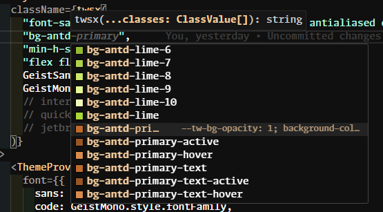 Tailwind color intellisense
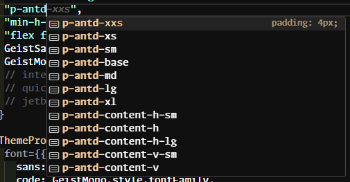 Tailwind padding intellisense
Preview
Preview
#Conclusion
I decided to create this because I wanted a smoother workflow when using Ant Design alongside TailwindCSS.
There definitely room for improvement, but right now I'm pretty satisfied with how it's improve my productivity.
If you notice there a mistake or there a better way to do this, please let me know so I could learn from my mistake!
There definitely room for improvement, but right now I'm pretty satisfied with how it's improve my productivity.
If you notice there a mistake or there a better way to do this, please let me know so I could learn from my mistake!
Thank you for reading, hope you find this article helpful!